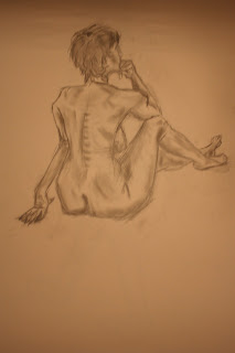
These are the drawing from the first life drawing lesson. I was very happy with the second outcome when we got to draw the nude model, I thought the shading ended up quite well, the feet aren't as good, however but that had a lot of to do with the position I was drawing from as I could't get my hand to the right angle when it came to drawing at the bottom of the page.. The last drawing was more of a quick sketch which I managed to finish quite early, so I decided to kill some time by adding some colour to the drawing and ended up looking not bad! When we first started making these and Simon was modelling for the first pose it got quite tricky because the shoes where much larger propotions than if he was standing bare feet so had to improvise a little bit with this one.
This was the first position we had to do during our second lesson. The lecturer told us to think of the body as a volume in space, so I decided to experiment with different shading on the body, which is what maked it stand out more and look more like a 3 Dimensional figure. As you can see from this, and the previous drawings Ive been having some issuea with drawing the hands so I've been practicing with the anatomy of human hands.
These are the experiments where we werent meant to take the pencil off the paper to help us understand how the body was built. My drawings are usually quite sketchy as I use alot of lines to make one shape hence the first one looks very dark and sharp. The others dont because I decided to use a harder pencil to make the drawing easier to correct etc.. The middle picture was actually the last pose we did, which was the shortest one, in which I decided to draw it my own way and apply shading etc... sadly didnt get to finish it as it was already the end of class (sorry that the middle picture is the wrong way up, but blogger yet again decided to have the mind of its own and wont allow me to have it my way =/)


Nice work, you can really see the critical eye you've used to get the scale right in these pictures. However, your form could use some work e.g. the 4th picture has its arm in an impossibly uncomfortable position.
ReplyDeleteKeep it up, just remember to look at your picture from afar and correct these issues.
Thanks Josh (:
ReplyDeletehaha yeah it does! I had some issues when it came to drawing up that arm actually =/, was in quite weird perspective and nothing looked right...
Ill have a chance to try and do better tomorrow (: